Design Principles Document
Ulises M. Melgarejo
Visual Hierarchy
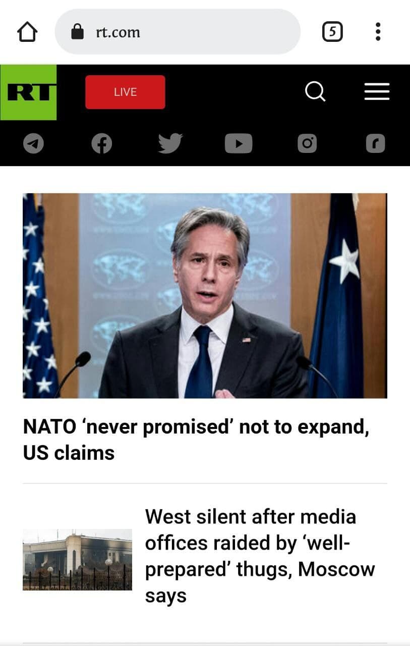
RT News
The RT website here shows clearly a visual heirarchy. The headline "NATO 'never promised' not to expand" draws our attention, then the image of a political figure makes us wanting to read it to know what happened. The 3rd thing that would atract attention is the next new, wich is related to the first one, a bit smaller but still seems quite important and urgent.
Law of Proximity
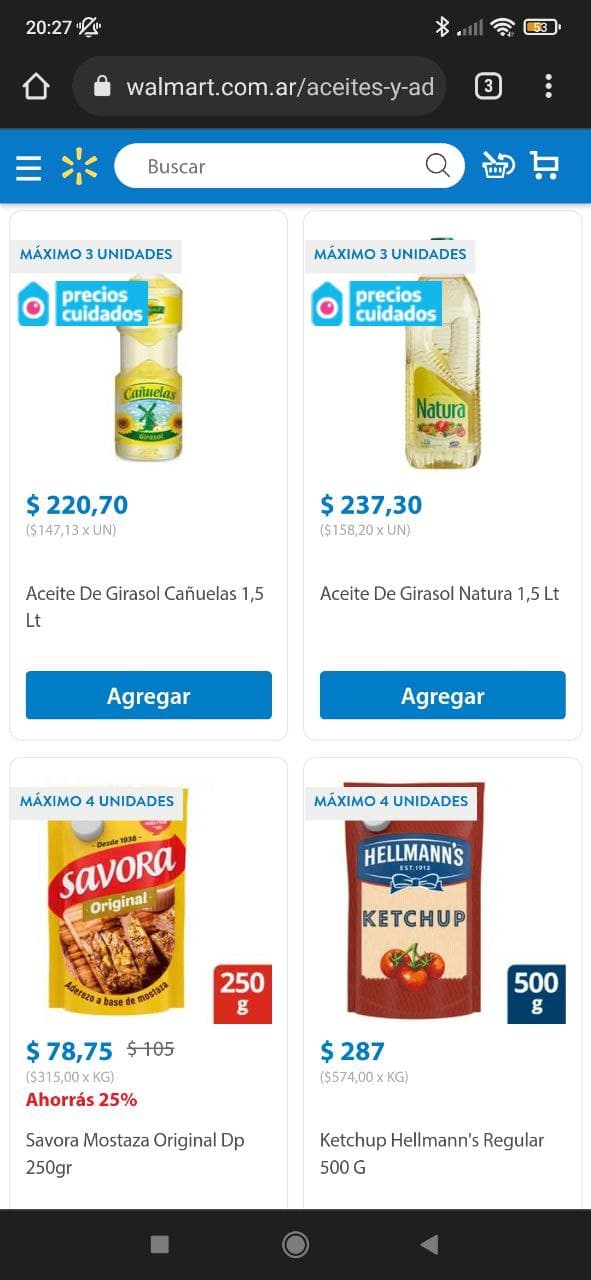
Walmart
Walmart website uses Law of Proximity quite well. This section in special, shows you some of their best prices. Also, everything is quite well done, spaces are just perfectly aligned, not too much and not too little
Hicks Law
Ali Express
This Ali Express website displays Hicks Law in a beautiful way, they help us to make choices by categorizing links and each link leading to category with filtering of choices to guide us (the user) quite easily to what they want...or what they might think they want. This is a resource used by many websites, especially those that sell stuff.